
If you’ve ever looked at premium Shopify stores and wondered,
How are they showing those smooth scrolling reviews with a thin scrollbar?
…then this article is for you.
I recently helped build a custom reviews section that looks clean, modern, and feels native — no apps, no heavy JavaScript, and no performance hit. Let me walk you through exactly how it works and why this approach is better.
Take your online store to the next level with a skilled Shopify expert.
Whether you’re starting from scratch or need improvements on your existing store, I provide custom solutions to optimize performance, enhance user experience, and boost sales. With in-depth knowledge of Shopify, I specialize in creating seamless, responsive, and user-friendly e-commerce websites.
Why I Didn’t Use a Slider App (and You Shouldn’t Either)
Most Shopify review sliders are built using:
- Heavy JS libraries
- Third-party apps
- Autoplay animations that hurt UX
The problem?
- Slower page speed
- Layout shift issues
- Limited design control
Instead, we use pure CSS + native horizontal scrolling, which is:
- Faster
- More accessible
- Easier to maintain
- Google-friendly
This approach feels premium and natural, especially on mobile.
Suggested Read: Build Your Own Box: Shopify Custom Landing Page Without App
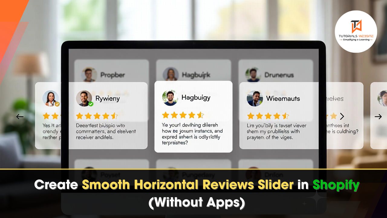
What We’re Building (Quick Overview)
Desktop
- 3 review cards visible
- Horizontal scrolling
- Ultra-thin scrollbar
Mobile
- 1 full review card
- Next card visible by ~10%
- Swipe-friendly
This feels modern, fast, and premium.

Create a Premium Horizontal Reviews Slider in Shopify (Full Code + Setup Guide)
Step 1: Create a New Shopify Section
Go to: Online Store → Themes → Edit code
Now create a new file: Sections → Add a new section
Name it: reviews-slider.liquid
Step 2: Paste the COMPLETE CODE Below
This is the full section code — HTML, CSS, and schema included.
Just copy and paste below code in: sections/reviews-slider.liquid
{% schema %} { "name": "Reviews Slider", "settings": [ { "type": "text", "id": "heading", "label": "Heading", "default": "Reviews" }, { "type": "text", "id": "subheading", "label": "Subheading", "default": "Read what our mithai fam has to say!" } ], "blocks": [ { "type": "review", "name": "Review", "settings": [ { "type": "text", "id": "title", "label": "Review title", "default": "Amazing experience!" }, { "type": "textarea", "id": "content", "label": "Review text", "default": "This is one of the best sweets I’ve ever had." }, { "type": "image_picker", "id": "avatar", "label": "Author image" }, { "type": "text", "id": "author", "label": "Author name", "default": "Customer name" } ] } ], "presets": [ { "name": "Reviews Slider", "blocks": [ { "type": "review" }, { "type": "review" }, { "type": "review" } ] } ] } {% endschema %} {{ section.settings.heading }}
{{ section.settings.subheading }}
{% for block in section.blocks %}{% endfor %}★★★★★{{ block.settings.title }}
{{ block.settings.content }}
{% if block.settings.avatar != blank %}{% endif %} — {{ block.settings.author }}
Step 3: Add the Section in Theme Editor
- Go to Online Store → Themes → Customize
- Navigate to Home page (or any page)
- Click Add section
- Select “Reviews Slider”
- Add as many review blocks as you want

Done 🎉
Take your online store to the next level with a skilled Shopify expert.
Whether you’re starting from scratch or need improvements on your existing store, I provide custom solutions to optimize performance, enhance user experience, and boost sales. With in-depth knowledge of Shopify, I specialize in creating seamless, responsive, and user-friendly e-commerce websites.
How This Layout Actually Works (Simple Explanation)
Instead of a JavaScript slider, we use:
display: gridgrid-auto-flow: columnoverflow-x: auto
This tells the browser:
Place cards horizontally and let the user scroll naturally.
On desktop screens, we calculate the width so exactly three cards fit:
@media (min-width: 990px) {
  .reviews-grid {
    grid-auto-columns: calc((100% - 48px) / 3);
  }
}
Why this matters:
- Cards always align perfectly
- No awkward spacing
- Fully responsive
On mobile 1 Card + 10% Preview, instead of hiding the next card, we intentionally show a preview. This subtly tells users: Hey, you can swipe here.
@media (max-width: 989px) {
  .reviews-grid {
    grid-auto-columns: 90%;
  }
}
Mobile Screen Output:

Why This Is Better Than Slider Apps
From real experience:
- No JS libraries
- No CLS issues
- No performance hit
- No dependency risk
- Fully theme-editor friendly
This is how modern, high-quality Shopify themes do it internally.
Do you want to get implementation help, or modify or extend the functionality of this script? Submit a paid service request
Conclusion
If you’re serious about building a modern, high-converting Shopify store, the way you display customer reviews matters more than most people realize.
This custom horizontal reviews slider gives you exactly what premium brands aim for:
- A clean and professional layout
- Smooth, native scrolling without heavy JavaScript
- A mobile-first experience with swipe and preview cards
- A thin, elegant scrollbar that looks subtle and intentional
- Full control from the Shopify Theme Editor — no apps require
If you want a Shopify reviews section that looks premium, performs well, and works perfectly on both desktop and mobile, this is one of the most reliable and scalable ways to build it.
Get a professionally designed and developed website tailored to your needs.
As an experienced website developer based in Delhi NCR, I offer customized solutions to build responsive, SEO-friendly, and user-friendly websites. Whether it’s for a personal blog, business site, or e-commerce store, I ensure your online presence stands out.
Also Read: How to Add Custom Section to Shopify Product Page without App

Pradeep Maurya is the Professional Web Developer & Designer and the Founder of “Tutorials website”. He lives in Delhi and loves to be a self-dependent person. As an owner, he is trying his best to improve this platform day by day. His passion, dedication and quick decision making ability to stand apart from others. He’s an avid blogger and writes on the publications like Dzone, e27.co