


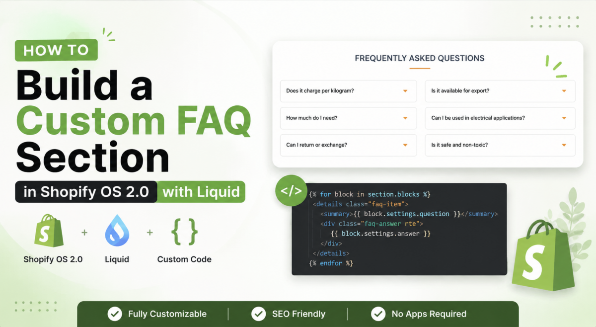
A good FAQ section does two things at once. It answers the questions customers are already asking before they hit the buy button, and it quietly handles SEO by targeting question-based search queries your product pages would never rank for on their own. Most Shopify stores either skip it entirely or use a bloated app that loads unnecessary JavaScript and slows the page down.
In this tutorial, I’ll walk you through how I built a fully custom, accessible, animated FAQ accordion section for a Shopify OS 2.0 theme — using four clean files, no app, no page builder, and zero dependencies.
Take your online store to the next level with a skilled Shopify expert.
Whether you’re starting from scratch or need improvements on your existing store, I provide custom solutions to optimize performance, enhance user experience, and boost sales. With in-depth knowledge of Shopify, I specialize in creating seamless, responsive, and user-friendly e-commerce websites.
What we are building
The finished section gives merchants a fully controllable FAQ accordion with these features:
- Animated expand and collapse on each question
- Two toggle icon options: a plus that rotates into an × and a chevron that flips
- 1 or 2 column layout on desktop, always single column on mobile
- Classic accordion mode (one open at a time) or free-open mode (multiple open at once)
- Full color control for background, heading, questions, answers, borders, and accent
- Up to 20 FAQ items, each fully editable from the Theme Editor sidebar
- Proper accessibility with
aria-expanded,aria-controls, androle="region"

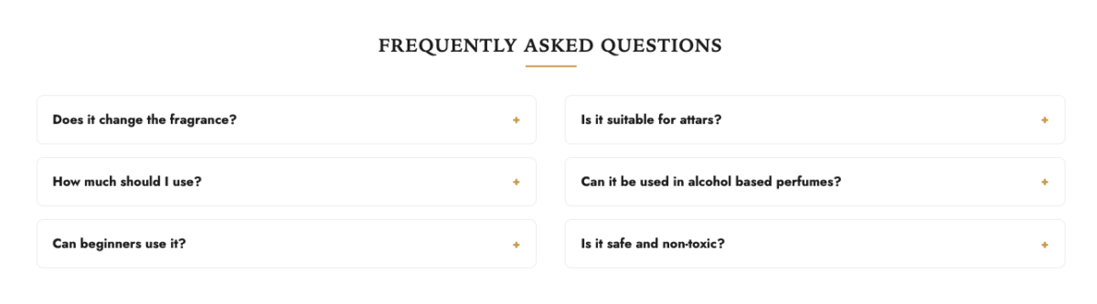
Files overview
This section uses four files. Each one has a clear, single responsibility:
theme/
├── sections/
│   └── faq.liquid              ← Section wrapper, grid, schema
├── snippets/
│   └── faq-item.liquid         ← Single accordion item renderer
├── assets/
│   ├── section-faq.css         ← All styles for the section
│   └── section-faq.js          ← Accordion open/close logic
Step 1: Create sections/faq.liquid
This file is the main section file. It loads the stylesheet, assigns settings to variables, builds the HTML wrapper, splits items into columns if needed, and includes the schema.
Load the stylesheet first:
{{ 'section-faq.css' | asset_url | stylesheet_tag }}Assign all settings to clean variables:
{%- liquid
  assign bg_color      = section.settings.bg_color
  assign heading_color = section.settings.heading_color
  assign accent_color  = section.settings.accent_color
  assign question_color = section.settings.question_color
  assign answer_color  = section.settings.answer_color
  assign border_color  = section.settings.border_color
  assign icon_style    = section.settings.icon_style
  assign columns_desktop = section.settings.columns_desktop
  assign single_open   = section.settings.single_open

  assign total = section.blocks.size
  assign half  = total | plus: 1 | divided_by: 2
-%}
The half variable handles the two-column split. If there are 6 items, the first column gets 3 and the second gets 3. If there are 5, the first gets 3 and the second gets 2. The | plus: 1 | divided_by: 2 formula handles the odd-number case cleanly.
Render the section wrapper:
<section
  class="faq"
  id="{{ section.id }}"
  data-faq-section
  data-single-open="{{ single_open }}"
  data-columns-desktop="{{ columns_desktop }}"
  style="
    --faq-bg: {{ bg_color }};
    --faq-heading-color: {{ heading_color }};
    --faq-accent-color: {{ accent_color }};
  "
>
Three data- attributes sit on the section wrapper:
data-faq-section— JavaScript uses this as the init selectordata-single-open— passes the accordion mode to JS without hardcoding itdata-columns-desktop— CSS uses this for the two-column grid rule
Render the heading:
{%- if section.settings.heading != blank -%}
  <div class="faq__heading">
    <h2 class="h3">{{ section.settings.heading }}</h2>
  </div>
{%- endif -%}
Render the grid with two-column split logic:
<div class="faq__grid">
  {%- if columns_desktop == '2' -%}

    <div class="faq__col">
      {%- for block in section.blocks -%}
        {%- if block.type == 'faq_item' and forloop.index0 < half -%}
          {%- render 'faq-item',
            block: block,
            item_index: forloop.index,
            icon_style: icon_style,
            accent_color: accent_color,
            question_color: question_color,
            answer_color: answer_color,
            border_color: border_color
          -%}
        {%- endif -%}
      {%- endfor -%}
    </div>

    <div class="faq__col">
      {%- for block in section.blocks -%}
        {%- if block.type == 'faq_item' and forloop.index0 >= half -%}
          {%- render 'faq-item',
            block: block,
            item_index: forloop.index,
            icon_style: icon_style,
            accent_color: accent_color,
            question_color: question_color,
            answer_color: answer_color,
            border_color: border_color
          -%}
        {%- endif -%}
      {%- endfor -%}
    </div>

  {%- else -%}

    <div class="faq__col">
      {%- for block in section.blocks -%}
        {%- if block.type == 'faq_item' -%}
          {%- render 'faq-item',
            block: block,
            item_index: forloop.index,
            icon_style: icon_style,
            accent_color: accent_color,
            question_color: question_color,
            answer_color: answer_color,
            border_color: border_color
          -%}
        {%- endif -%}
      {%- endfor -%}
    </div>

  {%- endif -%}
</div>
The loop runs twice in two-column mode — first pass renders index0 < half, second pass renders index0 >= half. This splits items evenly across both columns without JavaScript.
Load the script at the bottom of the section:
{{ 'section-faq.js' | asset_url | script_tag }}Loading the script here instead of the <head> means it only loads on pages where this section actually appears.
Step 2: Create snippets/faq-item.liquid
This snippet renders a single accordion item. It is a separate snippet rather than inline code for one important reason: it can be reused anywhere in the theme if you ever need FAQ items outside this section.
Assign defaults and build unique IDs:
{%- liquid
  assign icon_style    = icon_style    | default: 'plus'
  assign accent_color  = accent_color  | default: '#c9974a'
  assign question_color = question_color | default: '#1b1b1b'
  assign answer_color  = answer_color  | default: '#7a7a7a'
  assign border_color  = border_color  | default: '#eeeeee'
  assign panel_id      = 'faq-panel-'    | append: item_index
  assign button_id     = 'faq-question-' | append: item_index
-%}
The panel_id and button_id variables create unique, predictable IDs per item. faq-question-1 controls faq-panel-1. This is how the aria-controls and id pairing works for accessibility.
Render the accordion item:
<div
  class="faq-item"
  style="border-color: {{ border_color }};"
  {{ block.shopify_attributes }}
>
  <button
    type="button"
    class="faq-item__question"
    id="{{ button_id }}"
    aria-expanded="false"
    aria-controls="{{ panel_id }}"
    style="color: {{ question_color }};"
    data-faq-toggle
  >
    <span class="faq-item__question-text">{{ block.settings.question }}</span>
    <span class="faq-item__icon" data-faq-icon>
      {%- render 'icon-faq-toggle', style: icon_style, color: accent_color -%}
    </span>
  </button>

  <div
    class="faq-item__answer"
    id="{{ panel_id }}"
    role="region"
    aria-labelledby="{{ button_id }}"
    data-faq-answer
  >
    <div class="faq-item__answer-inner" style="color: {{ answer_color }};">
      {{ block.settings.answer }}
    </div>
  </div>
</div>
Four accessibility decisions built into this markup:
1. <button type="button">
Using a real button element means keyboard navigation works for free. Screen readers announce it correctly. No extra ARIA role needed.
2. aria-expanded="false"
Starts closed. JavaScript toggles this between "true" and "false" on click. Screen readers use this to announce whether the answer is visible.
3. aria-controls="{{ panel_id }}"
Tells screen readers which element this button controls. The matching id on the answer panel creates the explicit programmatic link.
4. role="region" and aria-labelledby="{{ button_id }}"
The answer panel is a named region. Screen readers can navigate directly to it and announce which question it belongs to.
Step 3: Create assets/section-faq.css
.faq {
  padding: var(--faq-padding-block, 4.5rem) 0;
  background-color: var(--faq-bg);
}

.faq__heading {
  text-align: center;
  margin-bottom: 3rem;
}

.faq__heading h2 {
  letter-spacing: 0.04em;
  text-transform: uppercase;
  font-weight: 600;
  color: var(--faq-heading-color);
  margin: 0;
}

.faq__heading h2::after {
  content: "";
  display: block;
  width: 60px;
  height: 2px;
  background: var(--faq-accent-color);
  margin: 0.9rem auto 0;
}

.faq__grid {
  display: grid;
  grid-template-columns: 1fr;
  gap: 0 3rem;
}

.faq[data-columns-desktop="2"] .faq__grid {
  grid-template-columns: 1fr;
}

@media (min-width: 992px) {
  .faq[data-columns-desktop="2"] .faq__grid {
    grid-template-columns: 1fr 1fr;
  }
}

.faq__col {
  display: flex;
  flex-direction: column;
}

.faq-item {
  border-bottom: 1px solid;
}

.faq-item__question {
  width: 100%;
  background: none;
  border: none;
  text-align: left;
  padding: 1.1rem 0.2rem;
  font-size: 0.9rem;
  font-weight: 600;
  display: flex;
  justify-content: space-between;
  align-items: center;
  gap: 1rem;
  cursor: pointer;
}

.faq-item__icon-plus {
  font-size: 1.2rem;
  line-height: 1;
  display: block;
  transition: transform 0.2s ease;
}

.faq-item__icon-svg--chevron {
  display: block;
  transition: transform 0.2s ease;
}

/* Rotate plus into × when open */
.faq-item__question[aria-expanded="true"] .faq-item__icon-plus {
  transform: rotate(45deg);
}

/* Flip chevron when open */
.faq-item__question[aria-expanded="true"] .faq-item__icon-svg--chevron {
  transform: rotate(180deg);
}

.faq-item__answer {
  max-height: 0;
  overflow: hidden;
  transition: max-height 0.25s ease;
}

.faq-item__answer-inner {
  padding: 0 0.2rem 1rem;
  font-size: 0.83rem;
}
Five CSS decisions worth understanding:
1. Data attribute grid switch
The two-column layout uses .faq[data-columns-desktop="2"] .faq__grid instead of a modifier class. This keeps the column setting entirely in the HTML data attribute, which the schema controls. No extra CSS class needed in Liquid.
2. max-height: 0 accordion technique
The answer panel starts at zero height with overflow: hidden. JavaScript sets max-height to the panel’s scrollHeight on open and removes it on close. The CSS transition on max-height creates the smooth animation. This is more reliable than animating height directly, which CSS cannot transition from 0 to auto.
3. Icon rotation via aria-expanded
The plus and chevron icons animate using CSS transforms triggered by the aria-expanded attribute on the button. No JavaScript class toggling needed for the animation itself. The state is already in the accessible attribute.
4. border-bottom: 1px solid with no color
The border color is set via inline style on each .faq-item in the snippet, pulling from the border_color setting. The CSS declares the border style and width but leaves the color to be injected per item.
5. Mobile always collapses to single column
The default grid is 1fr. The two-column rule only applies at 992px and up, so mobile always gets a clean single-column accordion regardless of what the merchant picks in the editor.
Step 4: Create assets/section-faq.js
function initFaqSection(root) {
  if (!root || root.dataset.faqInitialized === "true") return;
  root.dataset.faqInitialized = "true";

  var singleOpen = root.dataset.singleOpen === "true";
  var buttons = Array.prototype.slice.call(
    root.querySelectorAll("[data-faq-toggle]")
  );

  function closeItem(btn) {
    var answer = document.getElementById(btn.getAttribute("aria-controls"));
    btn.setAttribute("aria-expanded", "false");
    if (answer) answer.style.maxHeight = null;
  }

  function openItem(btn) {
    var answer = document.getElementById(btn.getAttribute("aria-controls"));
    btn.setAttribute("aria-expanded", "true");
    if (answer) answer.style.maxHeight = answer.scrollHeight + "px";
  }

  buttons.forEach(function (btn) {
    btn.addEventListener("click", function () {
      var isOpen = btn.getAttribute("aria-expanded") === "true";

      if (singleOpen) {
        buttons.forEach(function (b) {
          if (b !== btn) closeItem(b);
        });
      }

      if (isOpen) {
        closeItem(btn);
      } else {
        openItem(btn);
      }
    });
  });

  // Recalculate open panel heights on resize
  window.addEventListener("resize", function () {
    buttons.forEach(function (btn) {
      if (btn.getAttribute("aria-expanded") === "true") {
        var answer = document.getElementById(
          btn.getAttribute("aria-controls")
        );
        if (answer) answer.style.maxHeight = answer.scrollHeight + "px";
      }
    });
  });
}

function initAllFaqSections(scope) {
  var root = scope || document;
  root.querySelectorAll("[data-faq-section]").forEach(initFaqSection);
}

// Init on page load
document.addEventListener("DOMContentLoaded", function () {
  initAllFaqSections();
});

// Re-init when merchant adds or reloads section in theme editor
document.addEventListener("shopify:section:load", function (event) {
  initAllFaqSections(event.target);
});
Every time a merchant adds or reloads this section in the Theme Editor, Shopify fires a shopify:section:load event. Listening for it and re-running init ensures the accordion works correctly in the preview without a full page reload.
Step 5: Write the schema
The schema lives at the bottom of faq.liquid and builds the entire Theme Editor sidebar for this section:
{% schema %}
{
  "name": "FAQ",
  "tag": "section",
  "class": "shopify-section--faq",
  "settings": [
    { "type": "text", "id": "heading", "label": "Heading",
      "default": "Frequently Asked Questions" },
    { "type": "header", "content": "Colors" },
    { "type": "color", "id": "bg_color",
      "label": "Section background color", "default": "#ffffff" },
    { "type": "color", "id": "heading_color",
      "label": "Heading text color", "default": "#1b1b1b" },
    { "type": "color", "id": "accent_color",
      "label": "Accent color (underline, toggle icon)", "default": "#c9974a" },
    { "type": "color", "id": "question_color",
      "label": "Question text color", "default": "#1b1b1b" },
    { "type": "color", "id": "answer_color",
      "label": "Answer text color", "default": "#7a7a7a" },
    { "type": "color", "id": "border_color",
      "label": "Divider line color", "default": "#eeeeee" },
    { "type": "header", "content": "Layout" },
    {
      "type": "select", "id": "columns_desktop",
      "label": "Columns (desktop)",
      "info": "On tablet and mobile this always collapses to a single column.",
      "options": [
        { "value": "1", "label": "1" },
        { "value": "2", "label": "2" }
      ],
      "default": "2"
    },
    {
      "type": "select", "id": "icon_style",
      "label": "Toggle icon style",
      "options": [
        { "value": "plus",    "label": "Plus (rotates into ×)" },
        { "value": "chevron", "label": "Chevron (flips down/up)" }
      ],
      "default": "plus"
    },
    {
      "type": "checkbox", "id": "single_open",
      "label": "Only allow one answer open at a time",
      "info": "When on, opening a question closes any other open answer. When off, multiple answers can stay open together.",
      "default": true
    }
  ],
  "blocks": [
    {
      "type": "faq_item",
      "name": "Question",
      "settings": [
        { "type": "text",     "id": "question", "label": "Question",
          "default": "Does it change the fragrance?" },
        { "type": "textarea", "id": "answer",   "label": "Answer",
          "default": "No. Tenviya boosters are formulated to enhance performance without altering the original scent character of your fragrance." }
      ]
    }
  ],
  "max_blocks": 20,
  "presets": [
    {
      "name": "FAQ",
      "blocks": [
        { "type": "faq_item", "settings": {
          "question": "Does it change the fragrance?",
          "answer": "No. Tenviya boosters are formulated to enhance performance without altering the original scent character of your fragrance." }},
        { "type": "faq_item", "settings": {
          "question": "How much should I use?",
          "answer": "Start with 3–5% of total concentrate and adjust to taste." }},
        { "type": "faq_item", "settings": {
          "question": "Can beginners use it?",
          "answer": "Yes. Perform 10 is ideal for beginners, while Perform X suits professionals." }},
        { "type": "faq_item", "settings": {
          "question": "Is it suitable for attars?",
          "answer": "Yes, our boosters are compatible with attars and alcohol-based perfumes." }}
      ]
    }
  ]
}
{% endschema %}Take your online store to the next level with a skilled Shopify expert.
Whether you’re starting from scratch or need improvements on your existing store, I provide custom solutions to optimize performance, enhance user experience, and boost sales. With in-depth knowledge of Shopify, I specialize in creating seamless, responsive, and user-friendly e-commerce websites.
What merchants can control without touching code
| Setting | What it controls |
|---|---|
| Heading text | Section title |
| Background color | Full section background |
| Accent color | Heading underline and toggle icon color |
| Question text color | Each question button text |
| Answer text color | Each answer paragraph text |
| Divider line color | Border between each FAQ item |
| Desktop columns | 1 or 2 columns on desktop |
| Toggle icon style | Plus/× or Chevron |
| Single open mode | Classic accordion or multi-open |
| Add/remove questions | Up to 20 items, fully reorderable |
| Per-item question | Each question text |
| Per-item answer | Each answer text |
SEO benefit of a native FAQ section
A properly built FAQ section that uses real <button> and <div> elements gives Google something it can actually read. Apps that inject FAQ content via JavaScript after page load often fail to get indexed correctly. Native Liquid renders the full content server-side, which means every question and answer is in the HTML that Googlebot crawls. For FAQ content specifically, this matters because question-based queries drive significant organic traffic that product page copy rarely captures on its own.
If you want a custom Shopify section like this built for your store without touching a single line of code yourself, I offer Shopify development services in Delhi NCR for brands looking for clean, fast, theme-editor-friendly builds.
FAQs
No. You can build a fully functional, animated FAQ accordion directly in your theme using Liquid, CSS, and a small amount of vanilla JavaScript. A native section like this loads faster, costs nothing extra, and gives merchants full control from the Theme Editor without any third-party dependency.
Yes. The section uses Shopify’s standard OS 2.0 block and schema structure, so it drops into any Online Store 2.0 theme including Dawn, Craft, Refresh, and custom themes.
The schema sets max_blocks: 20, which means merchants can add up to 20 questions per section. If you need more, you can increase that number in the schema or add a second FAQ section on the same page.
Yes. The section includes a desktop column setting in the Theme Editor. Set it to 2 and the section automatically splits your FAQ items evenly across two columns on desktop. On mobile and tablet it always collapses to a single column regardless of this setting.
Yes. The section is built with full ARIA support. Each question uses a real <button> element with aria-expanded toggled between true and false on click. The answer panel has role="region" and aria-labelledby pointing back to its question button. This meets WCAG 2.1 accessibility standards for accordion components.


Pradeep Maurya is the Professional Web Developer & Designer and the Founder of “Tutorials website”. He lives in Delhi and loves to be a self-dependent person. As an owner, he is trying his best to improve this platform day by day. His passion, dedication and quick decision making ability to stand apart from others. He’s an avid blogger and writes on the publications like Dzone, e27.co


